
Generating Graphs from a Platemaker Wizard Workbook
The Platemaker Wizard provides the functionality to slice the large multidimensional dataset contained in the Flat Table into graphable chunks using the “Create Statistical Summary Table” program. Once these tables are created, it is then possible to run the Platemaker Wizard function “Generate Graphs”. This program automatically steps through each value of any selected filters in the Pivot table and exports the resultant statistical summary tables to a holding folder where they can be processed either by the Python Matplot program library or Prism Graph to completely automate the generation of graphs.
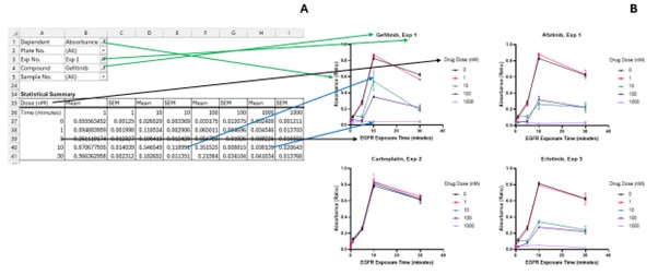
The relationship between a 2-dimensional Pivot data table in a Platemaker wizard-built workbook and a Prism or Python graph is as follows: 1) the first column row values of the data table always map to the x-axis values of the graph. 2) If the statistical summary table has more than 2 columns of data, the columns will represent the different values of one (or more) of your independent variables. These data will display as plots on the same graph with a graph legend that links each plot back to the value of the table column header value. 3) The Y-axis values are the mean values inside the main area of your data table, while error bars will be displayed if you have also chosen to calculate either SEM or SD inside your statistical summary table. 4) The mean and variance table values change depending on the filter settings of your pivot table. The graph itself captures the unique settings of the pivot table filters and so their values are included either in the Y-axis or graph’s main title as shown in as in Figure 1.
Create Graphs Form General Controls
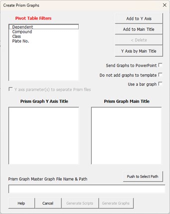
To use the Generate Graphs function, you must first be on a statistical summary page that has been built by the Platemaker wizard. For example, if you have a statistical summary page, similar to the one produced in tutorial 1 (part 1), then selecting “Platemaker Wizard  Generate Graphs” displays the user form of Figure 2.
From the introduction above, the component that changes the data inside the statistical summary table are the various Pivot filters your statistical summary table contains. The Pivot filter values are recorded either in the main title of the graph or as different Y-axis labels. Therefore, the Create Graphs form has 3 list boxes, one containing a list of all the pivot filters available on the statistical summary page, and two target list boxes that can receive any of these pivot table filters. If you leave the pivot table filter in “Pivot Table Filters” list box, then it will not be processed, nor will its values appear either in the main title or Y-axis title of the Graphs you subsequently generate.
At a very minimum this program requires one pivot filter placed in either the “Prism Graph Main Title” or the “Prism Graph Y axis Title” list box. These list boxes, along with the other controls on this form, are now described.
Pivot Table Filters: This list box contains all the pivot table filters that were included when you built the statistical summary page which is now the active worksheet.
Graph Main Title: This list box can take any pivot table filter and once a filter is added to this list box then the program will step through all the available values of this filter recording the value of the filter(s) in the title of the graphs it generates. For example, in tutorial 1 (part 1) we had a statistical summary table that contains a pivot filter for compound. If you access the dropdown list of this filter it appears as follows:
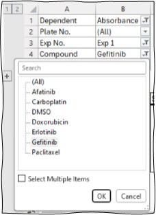
Therefore, if this filter was added to the “Prism Graph Main Title” list box, then the program will step through each of the compounds in turn sending the appropriate data for graphing and setting the title of the graph to the compound that is currently selected by the Platemaker Wizard graph generation program.
Including the Zero Dose Control in every graph plot
When the 0 dose negative controls are separate on the plate, but we want to include them in every graph, the correct setting for the Pivot Table filter is not a single drug, but a single drug plus the zero dose control. Such a setting looks like this:
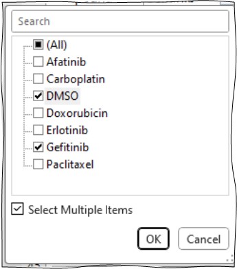
It is possible to set up the statistical summary table so that the Generate Graphs program steps through each drug whilst keeping the DMSO data continuously selected by first setting the compound filter to the negative control before you run the Generate Graphs program like this:
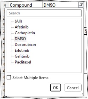
When you now run the Generate Graphs program, it will then keep the DMSO data continuously selected while it steps through the other compounds. However, it is important that you do not try to run the program with the multiple items option already selected. For example, if you try to run the Generate Graphs program with the following setting:
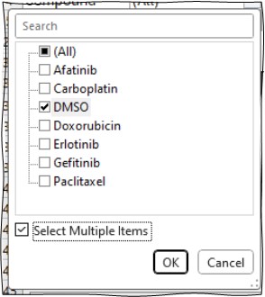
This following dialogue box will be displayed.
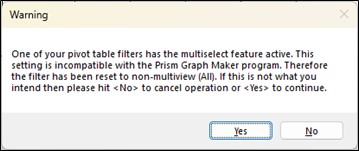
If you hit yes, in this example, although you would generate graphs for all your compounds, because the Pivot table filter has been reset to “All”, the zero dose control curve will be absent from all your compound graphs.
Graph Y axis Title: This can take any pivot table filter name although normally it only makes sense to put the dependent variable pivot filter name in this list box. Doing so indicates that you want to create a set of graphs for each dependent variable measurement in your workbook where each measurement forms the y-axis title of your graph. It is also permissible to leave this box empty. In this instance, it is normal for your dependent filter to be set to the dependent variable you wish to graph because if this filter is not set, then you are effectively graphing the mean of several different dependent variables which usually doesn’t make sense. Note if your experiment only has a single dependent variable (like our Data Analysis Demonstration workbook in tutorial 1, part 1) then the program will retrieve the Y-axis label directly from the Flat Data Table worksheet. If your workbook does contain multiple dependent variables, and you neither place the dependent variable in the Y-axis Title list box, nor select a specific dependent variable from the dependent variable filter section of your Statistical Summary worksheet, then when you run the Generate Graphs program you will be presented an extra dialogue box for you to manually name your Y-axis title as shown.
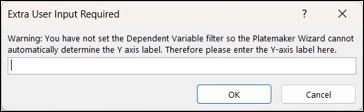
If you only place pivot filters in the Y-axis list box and leave the “Prism Graph Main Title” list box empty, then the Y-axis titles generated will be copied over to the main title of the graph so that each graph you produce still has a title.
Add to Main Title Button: Add item(s) that are currently selected in the Pivot Table filters and/or Graph Y Axis Title list boxes to the Graph Main Title list box.
Add to Y Axis Button: Add item(s) that are currently selected in the Pivot Table filters and/or Graph Main Title list boxes to the Graph Y Axis Title list box. Note it normally only makes sense to add the single Dependent filter to this list box.
< Remove Button: Removes items from the Graph Main Title and/or Graph Y Axis Title list box and returns them to the Pivot Table Filters list box.
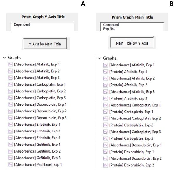
Order graph by: Only enables when there are items in both the Graph Main Title and Graph Y Axis Title list boxes. This toggle button controls the grouping of the graphs either on Python generated pages or inside the generated Prism Graph files (see Figure 6. The default “Y axis by main title” means that all the graphs for the first Y-axis value will be generated followed by the second Y-axis title and so on. Conversely pushing this toggle button changes its value to “Main Title by Y Axis” meaning that for the first value of the main title, all the Y-axis graphs are generated followed by the second Main Title and so on.
Python/GraphPad Prism Toggle button: Used to indicate whether the user wants to use Python to generate their graphs or the commercial program GraphPad Prism. Pushing this button changes the Python/Prism Graph specific information as described below.
How the program interprets multiple filters in the Graph Title or Y-axis list boxes.
Both the Graph Main Title and Y Axis Title list boxes can take multiple pivot filters. The order that the filters appear in the list box will determine the order in which the data is sent to Python or Prism Graph. Consider for example the two possible orderings for Compound and Exp No.
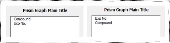
As with the ordering of column names on page 2 of the “Create New Data Entry Workbook”, the vertical order in the above tables is translated from top to bottom into left to right when the graph title is generated. From our screen shot example above, the graph titles will be: “Compound, Exp No.” and “Exp No., Compound respectively”. Likewise, the program steps through the filters moving from right to left (or bottom to top in relation to the above list boxes) so that in the left list box, the Exp No pivot table filter is changed first while holding the compound filter constant and then when this operation is completed, the next compound is selected and the Exp No. filter again is fully processed for all experiments. In contrast, in the right list table, the compound filter is first changed while holding the Exp No. filter constant and when all the compounds have been processed, the next Exp No. is selected, and the Compound filter again is fully processed for all compounds Figure 3.
Python Specific Form Options
Add python graphs to dedicated folder: By default, all graph files created by Python are saved in the same folder as the platemaker wizard workbook. If you want them saved in their own dedicated folder (that will be located inside the folder of your platemaker wizard workbook) then tick this option. When you push the Generate Graphs button and extra prompt will be displayed (see Generate Graphs section below). Note if you choose to save Python files in the same folder as the data workbook you have no option to overwrite previously generated files if you run the Generate Graphs program multiple times. Instead, any new files that result in file a file naming conflict will just have an appropriate number appended to their file name so that the new file has its own unique name. In contrast, if you use a dedicated folder for your Python Graphs, you can elect to overwrite old graph files with newly generated files.
Y-axis parameters page breaks: If both the “Graph Main Title” and “Graph Y Axis Title” list boxes contain Pivot table filters, then the “Y axis parameters page breaks” option will enable. This ensures that as Python places graphs onto pages (controlled by “Page layout option – see below) the pages will not have graphs with different Y-axis titles because if the Y-axis label changes, a new page will be created to receive the graphs for the new dependent variable value. This option is also affected by the order graphs by toggle setting (see above). If graphs are ordered so that the main titles are grouped together (Main Title by Y Axis) then this option will say Title Parameter Page Breaks because now a new page will be generated for each new graph title with the different Y-axis graphs added together on the same page.
X-axis log scale: Sets the x-axis of all the Python graphs to a log scale which is useful if you are plotting dose response data.
Y-axis log scale: Sets the y-axis for all the Python graphs to a log scale. Useful if dependent (measured) variables span many orders of magnitude.
Page Layout Section: Controls how many graphs are placed on an A4 page. The maximum allowed number is 9 (3 graphs per column by 3 graphs per row) down to a single graph per page (1 graph per column and row). You can also change the A4 page orientation from portrait (long page edge vertical) to landscape (long page edge horizontal).
Save Graph as Section: Can save graphs straight to PDF for printing purposes or as an image PNG file for pasting into presentations or research papers. Can also elect to generate both file types.
Fixed Y axis limits: If this option is left unticked, then all the graph y-axes will be auto-scaled to include every dependent variable datapoint. You can opt to fix the axis scale which is especially useful for percentage data as then you can directly compare the percentage response across different graphs. Once you tick the Fixed y axis limits option, the Min and Max boxes will become active for you to enter the minimum and maximum Y-axis values respectively.
Generate Graphs: This button executes the program to generate your Python graphs. If the user specified that Python graphs should be saved in their own dedicated folder, then the following extra dialogue box will appear where the user can type the folder name that will hold their Python-generate graphs.
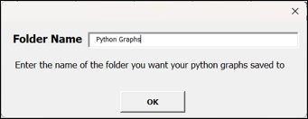
Note the program automatically adds the word “graphs” after whatever label you supply unless you add it in the folder name as shown above. If you select a folder that already exists, the following dialogue will inform the user the folder already exists.
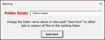
If you click the button “Save here” a second dialogue box appears:
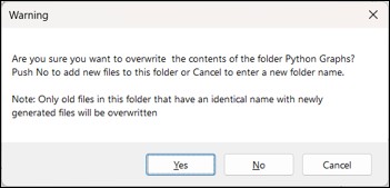
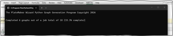
You have three options. Clicking “Yes” will overwrite any files with the same name as the new files that are generated (other files in the folder will not be deleted). Clicking “No” will preserve all files already in the folder so new files that have the same name as files already in the folder will have a number added to them to resolve the file naming conflict. Clicking “Cancel” will return the user to the Folder Exists form, allowing the user to enter a new folder name that does not conflict with previous folder names in the active workbook folder. When the Create Graphs program executes, and a new command window will open showing the progress of the Python script at creating the requested graphs.
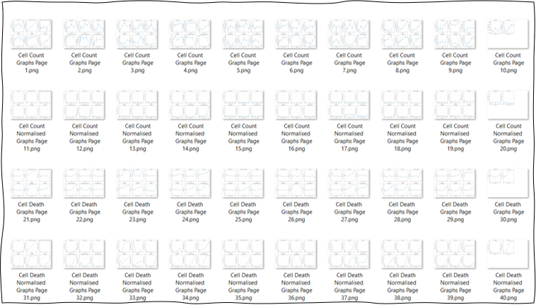
When this has window closes, all the graphs will be either now in the folder along with your workbook file, or in their own dedicated subfolder as shown.
For the Generate Graphs option to operate, a copy of Python and its required libraries must be installed and accessible for the current user. If neither of these conditions are met, then another dialogue box will be displayed (see Installing Python for more details)
Generate Python Script: If you do not have Python configured to use the Generate Graphs command, you can request to Generate a Python Script that can be run inside a Python programming environment later independent of the Platemaker Wizard. After pushing the Generate Python Script button, a dialogue box appears showing the folder path where python script file has been saved.
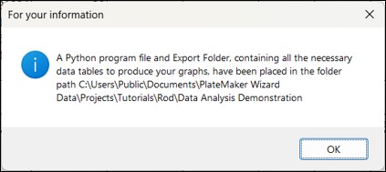
The Platemaker Wizard saves all the exported tables in the folder called “Data Export1 and the Python script that will process these files is saved in the same folder as the active workbook as shown in Figure 4. Running the Python Script file will build all the Python graphs and then delete the Export Data folder when it completes. Obviously, the Python script file cannot delete itself when it completes, so once it executes, it can’t be run a second time because its data source has been deleted. Therefore, the user should manually delete the Python script after it has done its job.
Prism Graph Specific Form Options
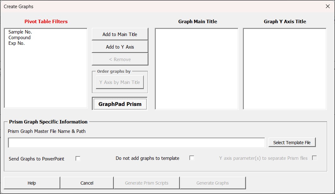
Because the format each generated Prism Graph is controlled by the Prism Graph Master file that you select, there are fewer graph specific and layout options included in the Prism Graph specific part of the Create Graphs form (Figure 5).
Prism Graph Master File Name and Path: Requires the Prism Graph file name (and the full folder path) that will serve as the template for the new Prism Graph file build.
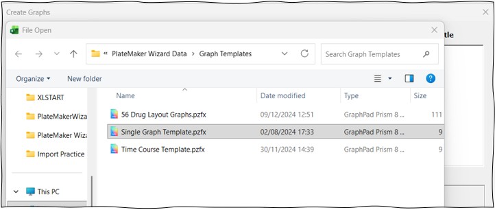
“Push to Select Path” Button: Push this button to bring up a standard file explorer window which allows the user to select the appropriate Prism Graph file anywhere on the computer that will serve as a template for the newly created Prism Graph file. When you push this button the file explorer window will first open in the Platemaker Wizard’s default Graphs Template folder whose folder path is set in the Program Options menu of the Platemaker Wizard.
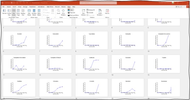
Send Graphs to Powerpoint button: If you tick this option before generating your graphs an extra command is added to the Prism Graph script file that instructs Prism to send the graphs to Powerpoint slides producing a Powerpoint presentation similar to the snippet below.
Do not add graphs to template: Any Prism graph file can serve as template including Prism graph files which already contain many graphs and previously built layouts (see the 56 Drug Layout Graphs.pzfx as an example). If you are using a Prism Graph file that already contains all the data container sheets and related graphs to receive your exported table data, then you do not want to be adding new container sheets with their related graphs to a copy of that Prism Graph file. Ticking this option means that the script file will take the data and add it to already existing container sheets in the copy of Prism Graph file it made from the selected template. Note: if the selected Prism Graph template file has only 5 data containers, and your pivot table filters result in seven separate tables, then the Prism Graph script file will error when it attempts to import the 6th data table because there is no corresponding container in the receiving file to receive the data.
In contrast, if this option is not checked then it is assumed the program is working with a Prism graph file that contains a single datasheet and graph. The script file will then replicate this single data sheet the number of times required to receive all the data tables the Platemaker Wizard has exported. This will be a problem if in fact the Prism Graph file does contain multiple data sheets, so it is important to get this option setting to match the design of the Prism Graph file being used as a Template.
Y-axis Parameters to Separate Prism Files: When there are pivot filters items in both the “Graph Main Title” and the “Graph Y axis Title” list boxes, the “Y axis parameter(s) to separate Prism files” option enables. If you select this option then graphs with different Y-axis titles, which are uniquely created by the individual values of the pivot table filters in the “Graph Y Axis Title” list box, will be sent to separate Prism Graph files. If Pivot filter selections are going to generate large number of graphs, the “Y axis parameters to separate Prism files” option should be ticked because Prism graph files do have an upper limit to the number of graphs and data sheets they can contain2. Also, too many graphs in a single Prism Graph file can make them difficult to navigate.
When the “Prism Graph Y Axis Title” list box contains pivot table filters and the “Y axis parameter(s) to separate Prism files” option is unchecked, the Order graphs by section “Y-axis by Title” toggle button is active. This toggle button controls how the individual graphs are ordered inside the single Prism Graph file that the Platemaker Wizard creates (Figure 6). If the user only adds a Pivot table filter to the “Graph Y Axis Title” list box and leaves the” Graph Main Title” list box empty, then in this instance, all the graphs will be added to a single Prism graph file and the Y axis Parameters to separate Prism Graph files option will be unticked and disabled.
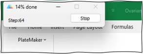
Generate Graphs Button: Starts the Platemaker Prism Graph generation program which will create the appropriate Prism Graph files by running Platemaker Wizard-generated Prism Graph scripts inside a minimized version of GraphPad Prism. The progress of the file build is shown in a small Prism Graph command window.
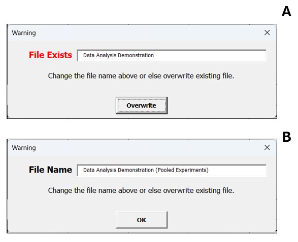
When this window closes, the Prism Graph file, or files (if you elected to send graphs with different Y-axis titles to separate Prism Graph files) will be saved in the same folder as your active workbook. If you are generating a single Prism Graph file, then its default name will be the same as your Excel workbook (with the Prism Graph extension pzfx). If you are generating multiple files, then the name will be the Excel workbook name plus the name of the Y-axis title (Figure 7A).
The program also adds appropriate hyperlink(s) to the Statistical Summary worksheet that open the related Prism Graph file(s) so the graphs can be easily viewed from within the Excel data workbook. If the program detects that a Prism Graph file with your data workbook name already exists, then the following dialogue box will appear where the user can enter a new name for the generated Prism Graph file(s) (Figure 8).
Trying to run Generate Graphs with Prism Graph already Open on your computer.
If you attempt to do this, Prism Graph will not run in minimised mode so the computer’s active window will switch out of Excel into Prism Graph. In this instance, the following information message will be displayed.
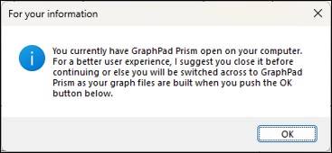
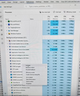
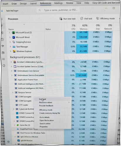
The latest versions of Prism Graph also runs part of the program as a background process. To close down a background process, you need to run the task manager. You can do this by first right clicking the mouse while your cursor is in the Windows task bar at the bottom of your screen. Then from that context menu select “Task Manager” and the window like that of Figure 9 will appear. Find the background process of “GraphPad Prism”, select it, and then right click your mouse a second time to select “End Task”.
You must have a fully licensed version of Prism Graph installed to run Prism Graph file generation scripts
Previous versions of Prism graph would run prism graph scripts even when Prism graph was not licensed and locked in viewer mode. Sadly, more recent versions require you to have a fully activated and paid for version of GraphPad Prism installed on your computer and accessible by the currently logged in computer user. If you attempt to generate graphs and you either do not have a functional copy of Graphpad Prism installed, or you only have Graphpad Prism installed in viewer mode, then a dialogue box will be displayed which will allow you to go to the GraphPad Prism website and obtain a license for the GraphPad Prism software (click here for more details).
Generate Prism Scripts: If you do not have GraphPad Prism installed on your computer, then you can elect to Generate the Prism Graph Scripts only and then later run these scripts in the GraphPad Prism software independently of the Platemaker Wizard. This approach is particularly powerful if your Platemaker Wizard Data folder is on shared network folder because then saved script files can be generated on any computer in your lab and processed on a machine that has license to operate the GraphPad Prism software. After pushing the “Generate Prism Scripts” button, a dialogue box appears showing the folder path where the Export folder and Windows script file has been saved.
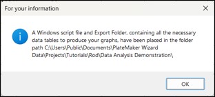
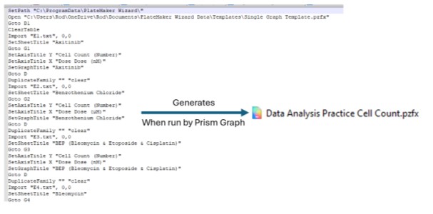
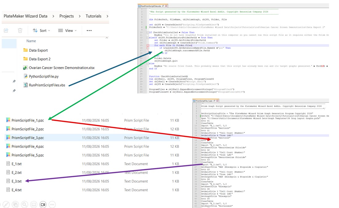
The program saves the exported tables in a folder called Data Export1. A Windows Script file is saved in the same folder as the data workbook. This file will run the Prism Graph Script files which will process the exported data files in the Data Export folder (Figure 10). Once the Prism Graph script files have completed, the Windows script file will delete them and the Data Export folder so that the computer hard disk is not filled up with redundant information.
Creating a Prism Graph Template File
This file is simply a normal Prism Graph file (not an actual Prism Template file which is different functionality supported by GraphPad Prism but not relevant here).
If you navigate to the Platemaker Wizard Graph Templates folder, located inside the Platemaker Wizard Data folder (which by default is in the public documents folder) you will find three example templates that are included with this program.

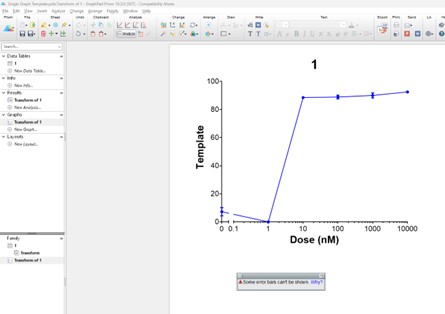
Opening the “Single Graph Template” file and you will see it is just a standard Prism Graph file which contains one graph family (Figure 11).
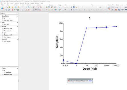
The Prism Graph program functionality to create such a file is beyond the scope of this manual but is easily achievable for those who know how to use GraphPad Prism to create graphs with the formatting they desire. As you use the Platemaker Wizard for your own experiments, first export a single chunk of data, using a Platemaker Wizard-generated Statistical Summary table, into an empty Prism Graph project. Next create all the graphical visualizations (and possibly more advanced statistical analysis) using GraphPad Prism before saving the Prism Graph file to the Platemaker Wizard “Graph Templates” folder (located in the Platemaker Wizard Data folder). Then you can select the newly created GraphPad Prism file to act as a template to receive new data that is generated from running the Platemaker Wizard on your currently open microtitre data container Excel workbook.
Footnotes:
1 The Platemaker Wizard allows the user to create multiple exports with their associated script files. Each time the user runs the Generate Graph Script program, the data export folder and the script file name are kept unique so if either folder or file name exists, then the new folder and file names have the number “n” appended to them (where “n” is a number to keep the folder and file name unique).↩
2 In earlier versions of Prism this was 100 Graphs.↩