Platemaker Wizard Data Visualization
Background
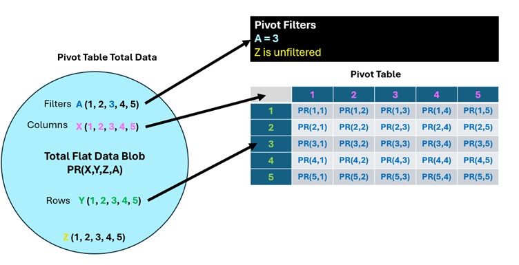
The totality of the Flat Data table can be thought of a giant “blob” of data where it is possible to calculate a single grand average plate reading value of all the rows of the Flat Data table, which of course has no experimental meaning. The point of a pivot table is to take the Flat Data table’s single column of plate readings and explode them out into the two possible dimensions of rows and/or columns creating smaller 2-dimensional tables with one or more independent variable values in the rows of the table and one or more independent variable values in columns. Finally, the other independent variables can be added to Pivot table filters allowing only plate readings that have independent variable values specified in the filters to be included in the pivot table.
Create Statistical Summary Table
Upon selecting the “Create Statistical Summary Table” from the main menu the form of Figure 2 will be displayed.
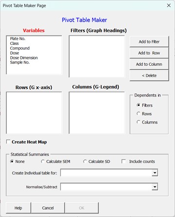
Variables List box: Contains all the columns of the Flat Data table.
Filters List box: Variable placed in this field will end up as filters which can be used to filter the data that is present in the produced statistical table.
Rows List box: All statistical tables are 2-dimensional tables containing both columns and rows. Any variables placed in the row list box will have all the values this variable equalled in the experiment, listed in rows. If the variable is a text variable, this list will be in alphabetical order or, if the variable is numeric, in ascending order from lowest to highest value. If more than one variable is placed in this box, then each variable will occupy its own column with variables in the left most columns (appearing first in the Rows List box) acting as group variables for the variables below it. This is similar to the combinatorial linking order of variables on page 2 of the “Create New Data entry workbook“ wizard.
Columns List box: Any variables placed in the column list box will have all the values that variable equalled in the experiment listed in columns. If the variable is a text variable, these will appear in alphabetical order or, if the variable is numeric, in ascending order from lowest to highest value. If more than one variable is placed in this box, then each variable will occupy its own row with variables in the top rows (or at the top of the columns list box) acting as group variables for the variables below it. This is similar to the combinatorial linking order of variables on page 2 of the “Create New Data entry workbook“ wizard.
Add to Filter button: Adds any variables that have been selected in the Variable list box (or any other list box) to the filter list box.
Add to Row Button: Adds any variables that have been selected in the Variable list box (or any other list box) to the rows list box.
Add to Column Button: Add any variables that have been selected in the Variables list box (or any other list box) to the Columns list box.
Delete Button: Returns any variables that have been selected in either the Rows, Columns or Filters list box to the variable list box.
Dependents In Options: If your experiment has more than one measured (dependent) variable (for example cell count and cell death) then this variable can be placed in either the Filters, Rows or Columns by selecting the required option from that box. Normally, you want to create separate heat maps or graphs for each measured variable in which case the dependent variables should be placed in the filter section of the pivot table. Note this option box is not present if your workbook only contains a single measured (dependent) variable.
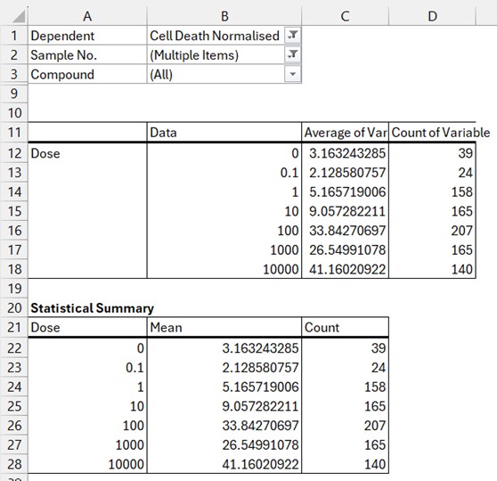
Statistical Summaries Section: As explained in the background above, the default behaviour of the Pivot table is to reduce the dimensionality of the Flat Data table microtitre plate readings into smaller chunks that are suitable for data visualisation. When these readings represent multiple assay repeats or experiments, then you most likely will want to also create graphs with error bars and so the Wizard gives you two main statistical variance calculation options: Standard Error of the Mean (SEM) or Standard Deviation (SD). You can also tick the option to include counts (how many individual values constitute the currently displayed calculated mean values) if you want this information as well. If you leave the option set to none (do not calculate SD or SEM), but tick the count box, then you will produce 2 sub-columns in your statistical summary table for Mean and Count only (Figure 3).
If you do select SEM without count or creating an individual table (see below), then the Platemaker wizard includes the counts in an intermediate table so it can calculate SEM as Standard Error of Mean is not a standard function that is provided in native Excel pivot tables.
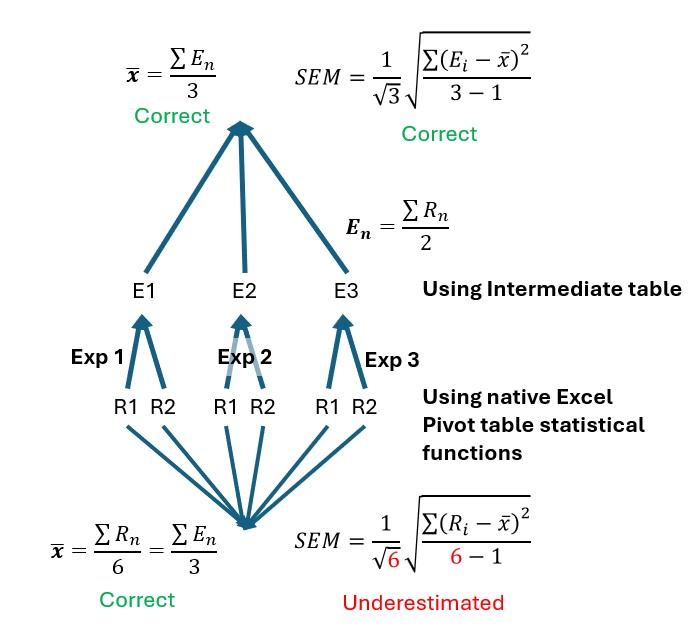
Create Individual Tables for: This adds an extra intermediate table where assay replicate data (whether that be plate well replicates, sample repeats, or experimental repeats) are first placed in columns before the average of these columns (and the SD or SEM if requested) are calculated using the values from this intermediate table rather than using the native Excel Pivot table statistical functions. If you have conducted an experiment similar to the second time course experiment of tutorial 1, it is very important you use this option when creating the graphs that show the mean data of your experiments. The reason for this is, in the time course experiment of tutorial 1, each compound dose was measured in duplicate and the whole experiment was repeated 3 times. If we attempt to calculate the SEM of our drug datapoints with our three experiments pooled, the n-number used for both standard deviation and standard error of mean calculation will, in this particular example, be 6 not 3 because each mean value is the mean of 6 individual readings: 2 readings multiplied by 3 experiments is equal to: 2×3=6. Therefore while the mean values will be correct, the SEM and SD will be underestimated because n in this case should be 3 not 6. What we really want is for the mean of each reading to first be calculated for each experiment and then the three separate experiment readings averaged to obtain a final experimental mean for each compound at a given dose (Figure 4).
Note it is not always possible for the Platemaker Wizard to create an intermediate table for multiple plate replicates if the number of plate replicates for the controls differs from the rest of the experiment (often that case in many plate designs). If you select to create an intermediate table which cannot be created, you will receive the following information message.
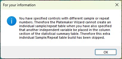
In this instance the statistical summary will still build it is just any sample variance calculations will be based on inbuilt Excel statistical functions rather than derived from the intermediate table where the each plate replicated is listed individually. However, the wizard will always be able to create an individual table that has the mean of each experiment in columns because when calculating the mean values for an entire experiment the differences in the number of control samples to other experimental samples is irrelevant as only the mean value of each experimental sample is required.
Normalise/Subtract Intermediate Analysis Table
Often when dealing with noisy biological data, normalising experimental treatments against plate controls can help standardise a cellular response across multiple experiments and treatments. The platemaker wizard offers the user several common normalisation strategies which can be selected from the dropdown list menu shown below.
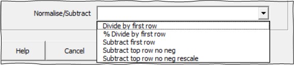
The Normalise/Subtract option is only available if you do not select to calculate either the variance or counts of your samples using native pivot table functions or you have opted to summarise your data using a create individual sample/repeat/experiment table. The dropdown list provides several different normalisation methods as follows:
Divide by first row: This makes sense if you have doses in rows in your statistical summary table and your lowest dose is a plate control. In this instance you are effectively applying the equation:

Where NV is normalised value, PR is individual plate reading and  is the mean control value. Normalising the data against the control creates a ratio so that if the absolute values of the controls varies from experiment to experiment, this control variation is removed from the overall mean data across all the experiments. Note that if the mean control value is zero then this calculation will fail because it results in an undefined divide by zero error.
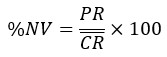
% Divide by first row: Similar to “Divide by first row” except all values are placed on a percentage scale so that values between 0 and 1 now range from 0 to 100%. This equation can be used when you expect your samples to have values which are less than the mean control value and the mean control value is scaled to 100%.
Subtract first row: applies the following equation.
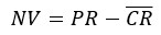
This equation can be used when you expect your samples to have values that are greater than the mean control value and you want the control values to be located on the graph at the origin.
Subtract first row no neg: This is the same as subtract first row except all values, where the result is a negative number (the sample reading is less than the average plate control) are set to zero. The equation applied uses an Excel logical if function such that:

This is useful as it stops negative Y-axis values appearing on any graphs when these normalised data are exported to Prism.
Subtract first row no neg rescale: This final option should only be used if your underlying data was originally a percentage. By subtracting the mean negative control value from all the percentage experimental readings, the maximum possible percentage of the experiment can now only be  . This final normalisation rescales the maximum value so it can still be 100 by applying the following adjustment.

It should also be noted that the underlying values that are used to calculate the mean plate control will be dependent on how any pivot table filters are set. For example, if you have included plate controls on every plate, but you want compounds on a particular plate normalised by only the controls on that same plate then you need to make sure that the plate No. filter is set to the correct plate so that only controls for that plate are included in the mean plate control values.
In the demonstration workbook, supplied with this program, one of the selectable dependent variables is cell death normalised. This calculation is based the same formula as applied using the “Subtract first row no neg rescale” above.
In Figure 5 we compare directly the calculations of normalising cell death first by the internal Flat Data formula, which was originally specified when the Demonstration workbook was built, against the calculations performed by the intermediate Offset Subtracted Normalisation Table that was created using the “Create Statistical Summary Table” program of the Platemaker wizard.
Although the results using either method essentially agree, the corresponding values are not identical, and the errors are larger using the post-hoc normalisation inside the statistical summary page. The more accurate calculation is obtained via the Flat Data formulas that were specified when the workbook was originally built because these formulas correctly manage the control data for each plate as explained in the legend of Figure 5.
Therefore, it is recommended, where possible, you specify all dependent variable normalisations using the equation editor on page 4 of the “Create New Data Entry Workbook” wizard rather than perform post-hoc normalisation which in this example is slightly less accurate although overall does not change the general result.
Incidentally, in our example, if the pivot tables for both analysis methods are set so that only a single plate worth of data is showing, then both methods, as expected, give identical values since they are using identical formulas (Figure 5C & D).
As with the necessity to pay close attention to the subtleties of transferring compounds to a 384 well plate using an 8 channel pipette so that accurate plate maps are maintained, so, with data analysis, care must also be applied to the scope of samples that are included in the averaging and other statistical functions of the pivot and subsequent data summary tables that are used to calculate the mean experimental values which form the basis of the data behind the various graphs and heat maps you create when analysing an experiment.

 Option click here for more details.